


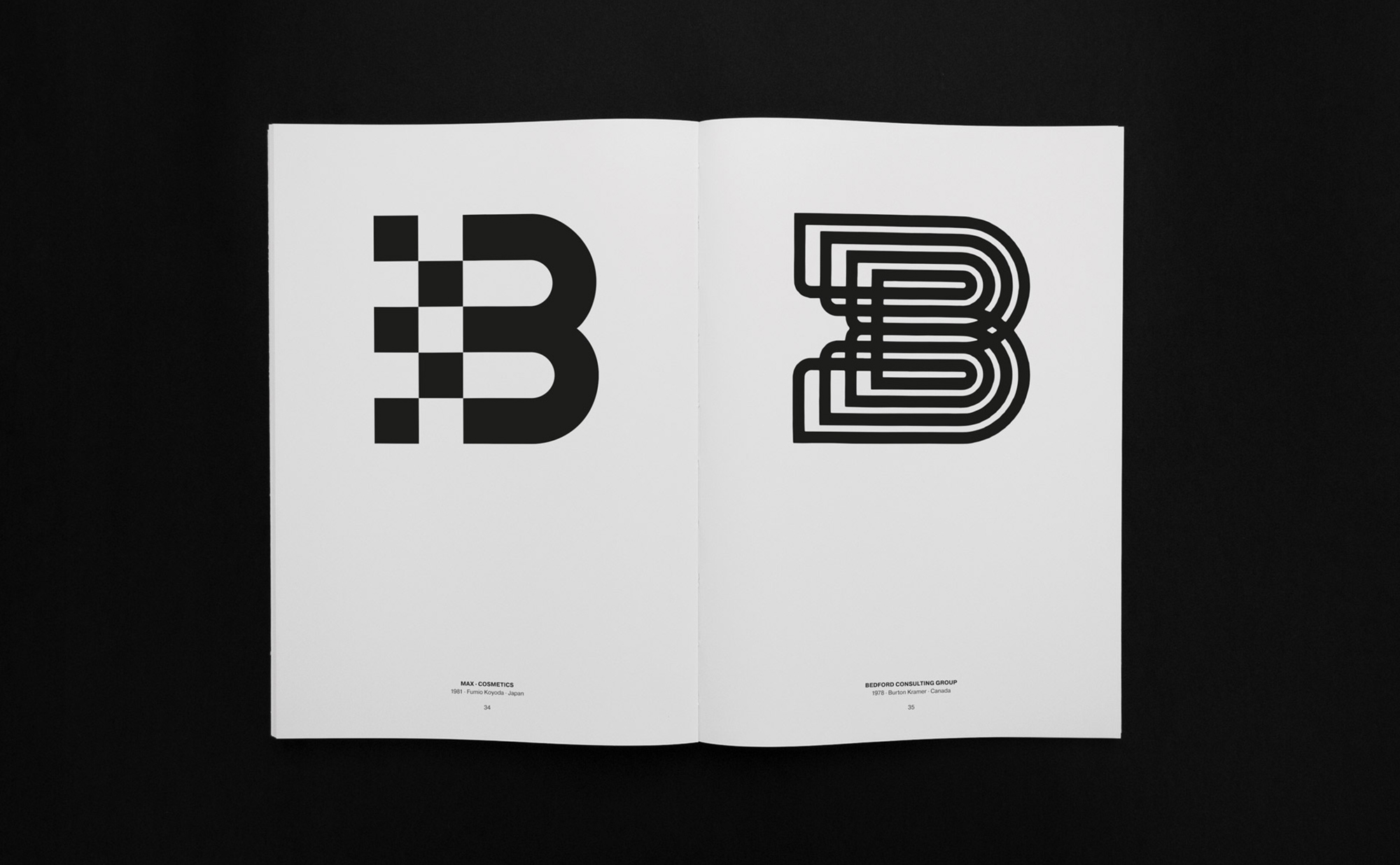

01. Letters As Symbols
An alphabet. The Latin alphabet to be more precise. 26 letters, from A to Z. That’s all what it takes for billions of people to be able to communicate with one another. Basic shapes based on typographical rules which make it possible for you to read and understand this text. Rules, which a designer or typographer happily use to bend and stretch in order to communicate a completely different message.
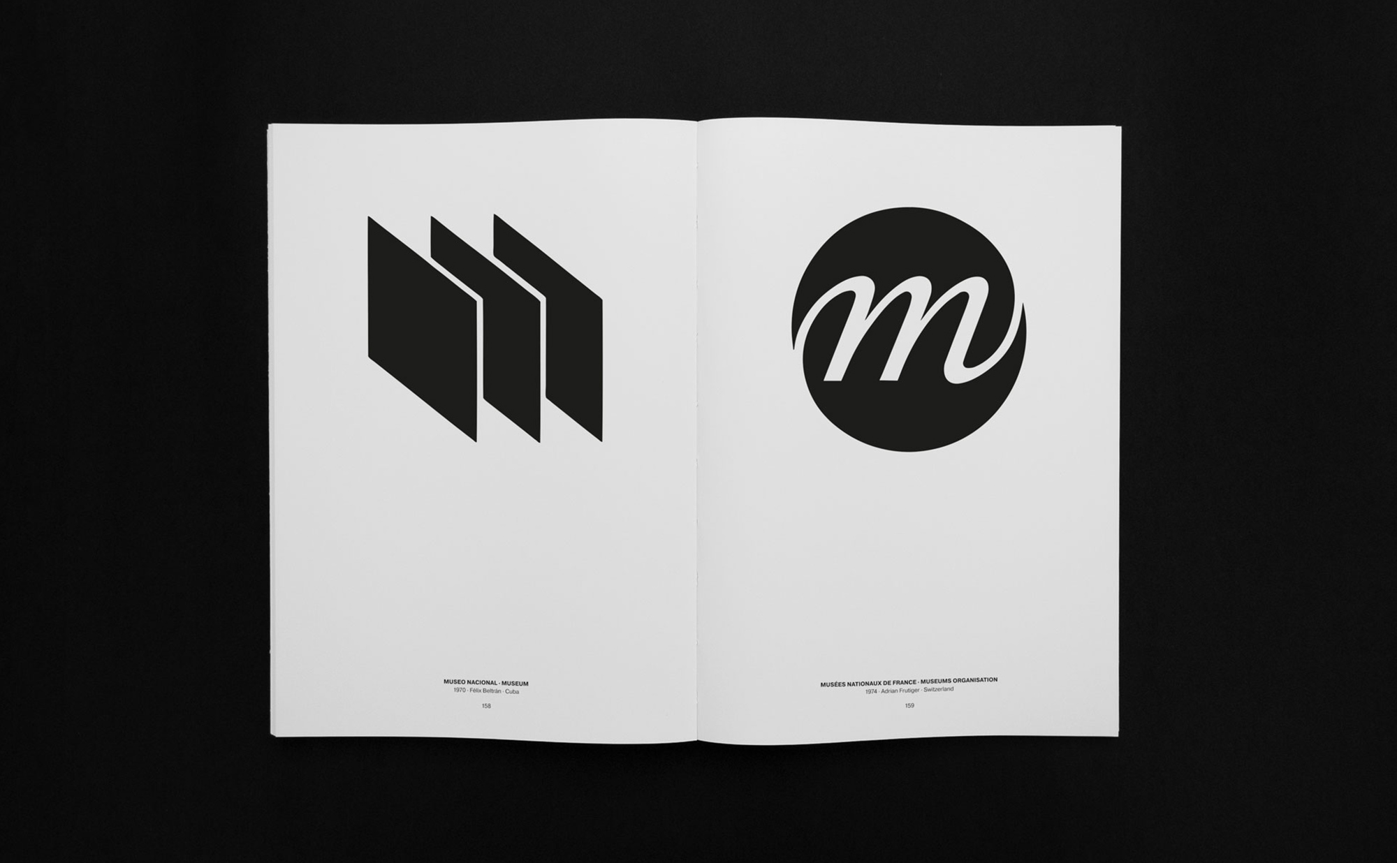
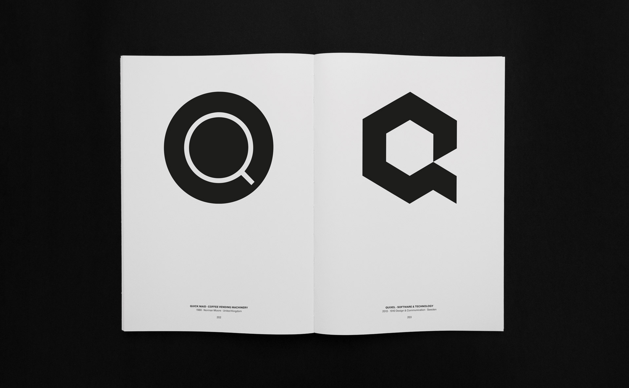
Letters As Symbols is an international selection of 306 trademarks, logos and symbols where every single one of them is a celebration of breaking and pushing the boundaries of typography. The book shows a combination of logos made by worldwide respected pioneers who have given shape to the industry as we know it today and the work of designers who have the same profound skill in logo design, but who don’t have the name or fame.
The book is therefore not only a celebration of letters as symbols, it is also a celebration of owning the skill of logo design.
-
This book was made in collaboration with the Belgian pioneer of graphic design, Paul Ibou. Published with the help and support of Stockmans Art Books.
More info: www.logo-books.com
An alphabet. The Latin alphabet to be more precise. 26 letters, from A to Z. That’s all what it takes for billions of people to be able to communicate with one another. Basic shapes based on typographical rules which make it possible for you to read and understand this text. Rules, which a designer or typographer happily use to bend and stretch in order to communicate a completely different message.
Letters As Symbols is an international selection of 306 trademarks, logos and symbols where every single one of them is a celebration of breaking and pushing the boundaries of typography. The book shows a combination of logos made by worldwide respected pioneers who have given shape to the industry as we know it today and the work of designers who have the same profound skill in logo design, but who don’t have the name or fame.
The book is therefore not only a celebration of letters as symbols, it is also a celebration of owning the skill of logo design.
-
This book was made in collaboration with the Belgian pioneer of graphic design, Paul Ibou. Published with the help and support of Stockmans Art Books.
More info: www.logo-books.com
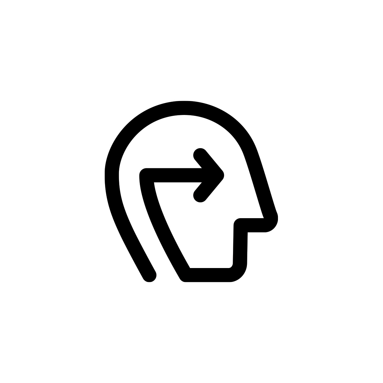
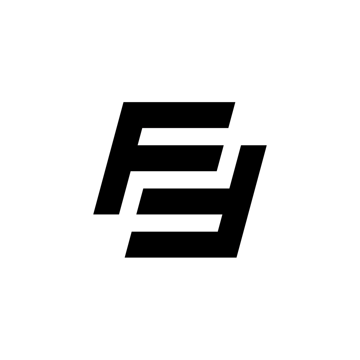
02. Face2Face
Small scale gaming community which was started by a couple of friends who wanted to take their gaming sessions to a central place where they could meet and play together. Face2Face started a Discord server for which they needed a logo to represent them and make the group recognizable.
The simplistic yet clever symbol depicts the name Face2Face as the abbreviation F2F.
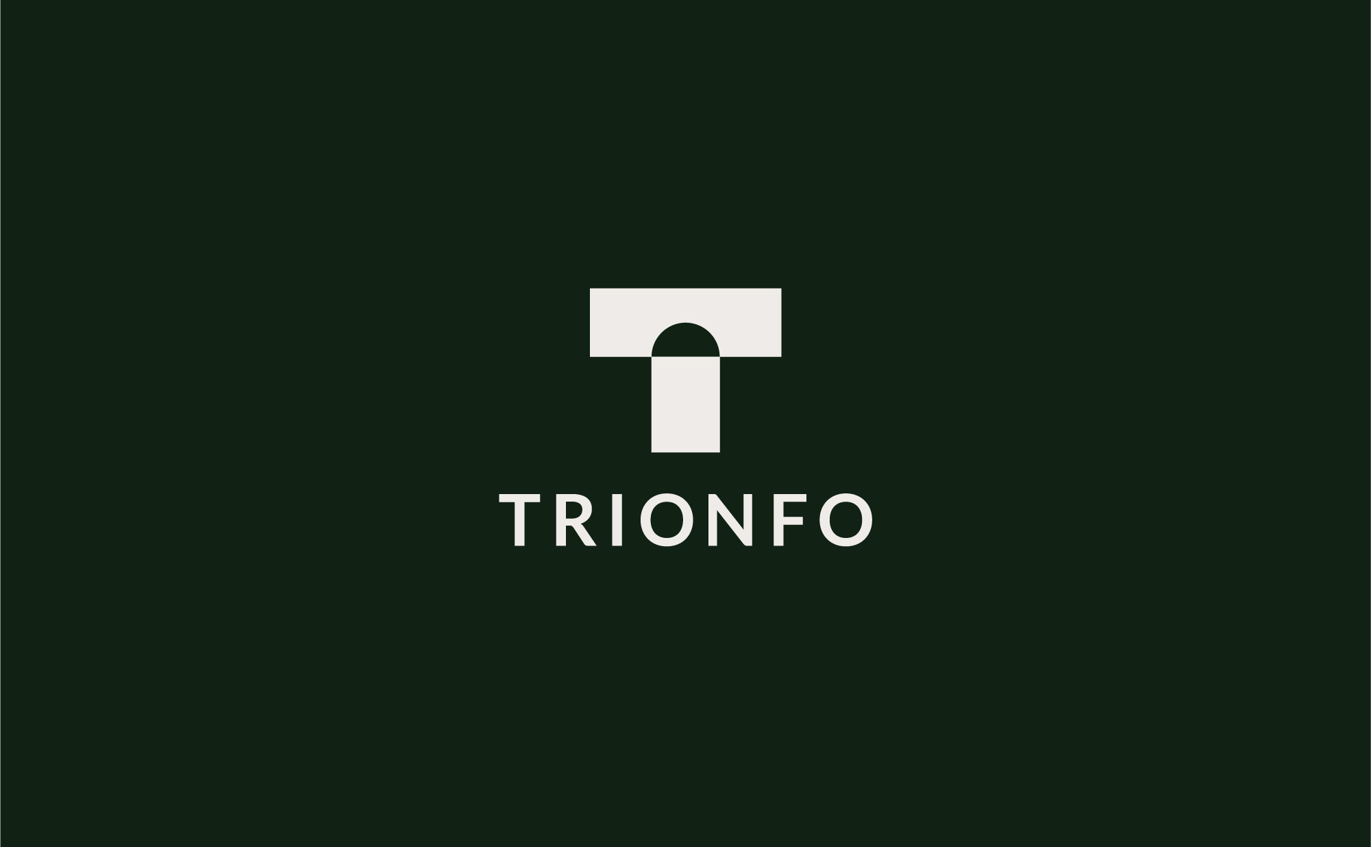
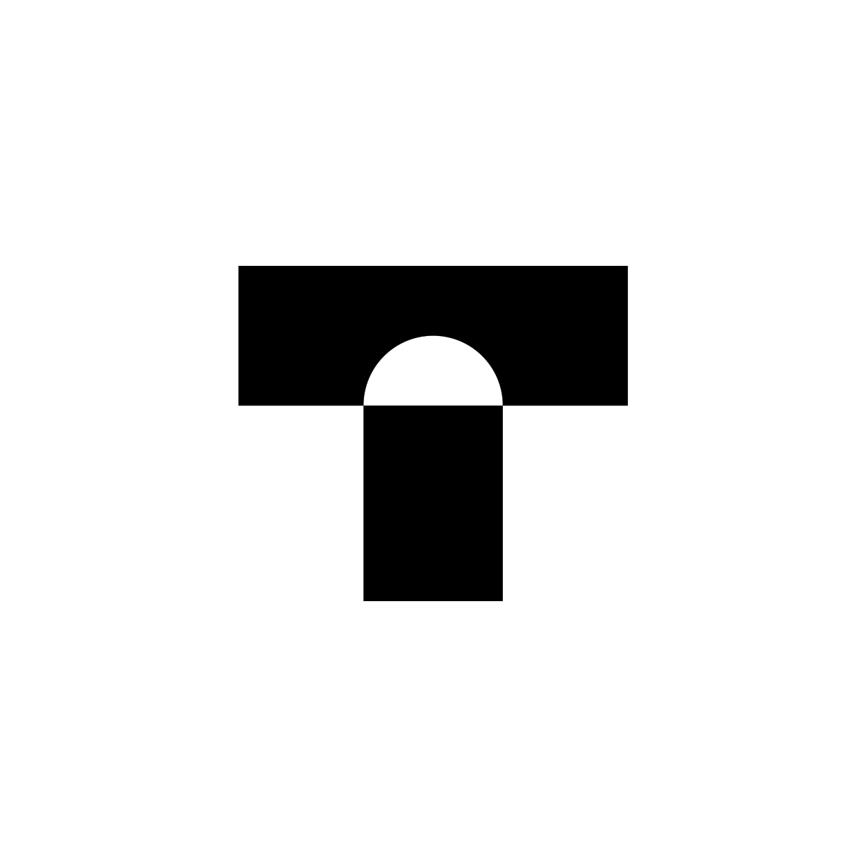
03. Trionfo
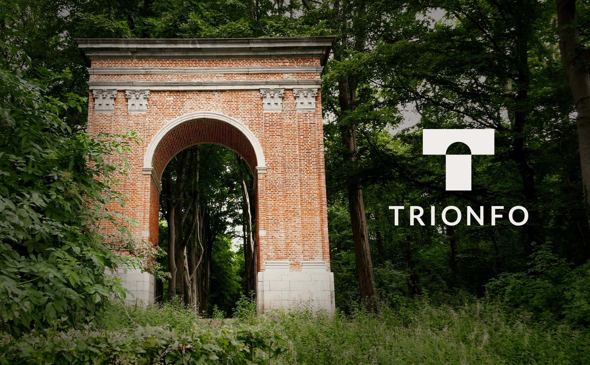
Trionfo is a B&B in Gaasbeek, Belgium located almost next to the castle of Gaasbeek. The name of the B&B is inspired by the arch which was built on the domain of the castle in 1813 during the period when marquis Paul Arconati (1754 - 1821) was the owner of the castle and the domain. The Italian was an ardent admirer of Napoleon and he saw the construction of the triumphal arch as a tribute to Bonaparte. The arch was supposed to be the starting point of a connecting road to Paris but it never got to that point.
The owners of the B&B wanted to incorporate this story into their logo. The concept of the B&B is not the classic super cosy, feel good, ‘welcome home’ as how we often see with B&B’s. Trionfo on the other hand focuses mainly on business people and will have a clean, minimalistic interior combined with a touch of natural wood. By aiming at this target group, Trionfo wants to be a place where business can be combined with a relaxing surrounding while offering the best of both worlds. Super modern interior with minimal distraction and for example, workshops on how to make your own Geuze.

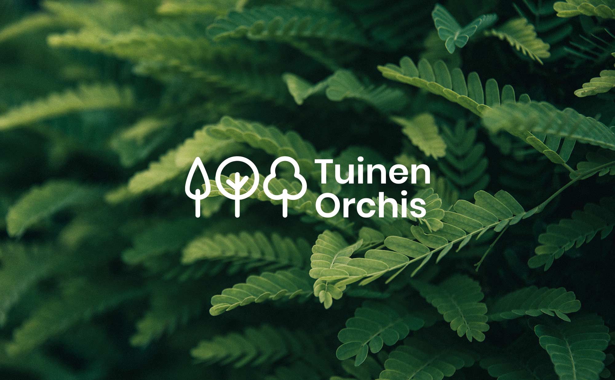
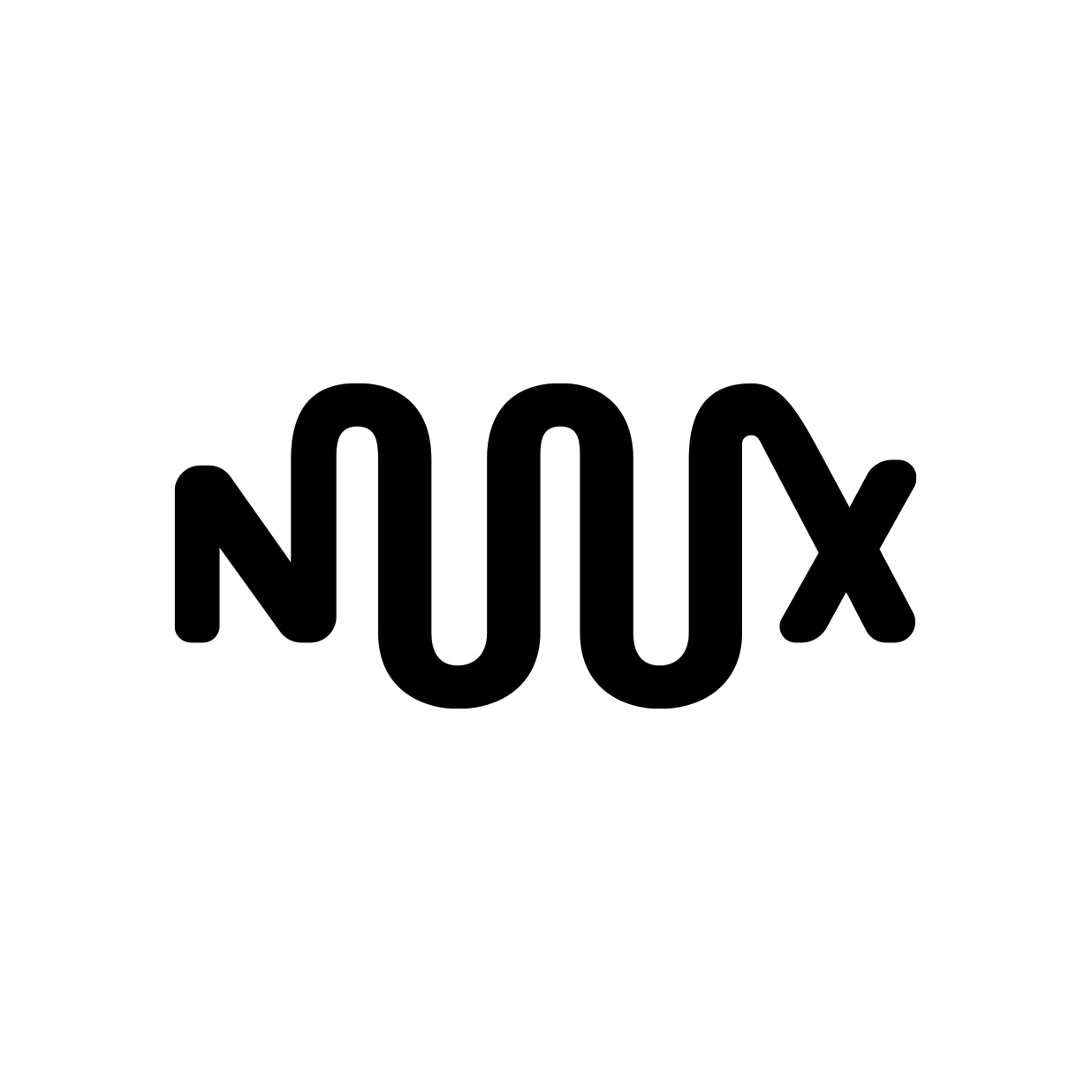
04. Tuinen Orchis
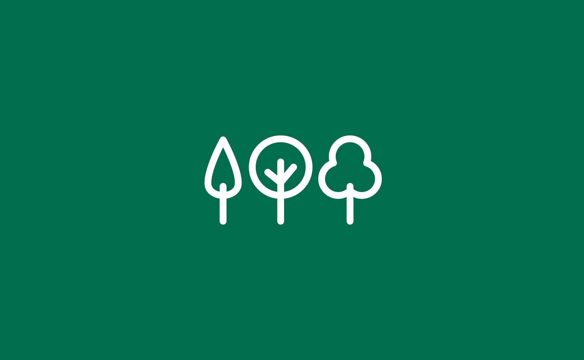
Tuinen Orchis is a small-scale business specialized in general garden landscaping and maintenance. The company works very locally and has the advantage of having a personal and direct contact with its customers. Since these characteristics are a major asset for Tuinen Orchis, it was therefore important to design a simple, recognizable and friendly logo. A logo with which the customers can identify themselves with.
The logo exists out of three simplified tree shapes with soft edges. The trees reflect the general maintenance services Tuinen Orchis is offering. The font was kept simple and straightforward, yet it has round shapes which contribute to the friendly and reachable characteristics of the company.